Result screen
The result screen is what a customer reaches at the end of the quiz: the products their answers picked, and the buttons that put those products in the cart. By the end of this page yours shows the right information on each card, adds to the cart the way you chose, and handles a sold out product without losing the sale.
Before you start
- A quiz open on its Questions tab.
- At least one product attached to an answer, since the cards show the products your answers voted for, see Product matching.
Where the result settings sit
Every quiz has a result screen, and you never create it. The app pins a Results row at the bottom of the left sidebar the first time you open the quiz in the editor, directly under Email gate. Neither row can be dragged, and neither carries a delete icon.
Select Results to open its settings in the panel on the right, titled Results page. The panel opens with three sections of content settings, Content, Add to cart and Products, and carries the appearance sections below them, among them Product cards and Tips & Description.
Two things this screen shows are set elsewhere. The label on a per-product button is a field of the quiz Design tab, 'Add to cart' button (per product). The description, the tips and the image that can surround the cards are written per scenario, in the Scenarios tab, see Result scenarios.
The product cards
The screen shows three products at most: the three that collected the most votes from the answers the customer gave. On a desktop screen they sit in a single centred row, each card capped at 280 px wide.
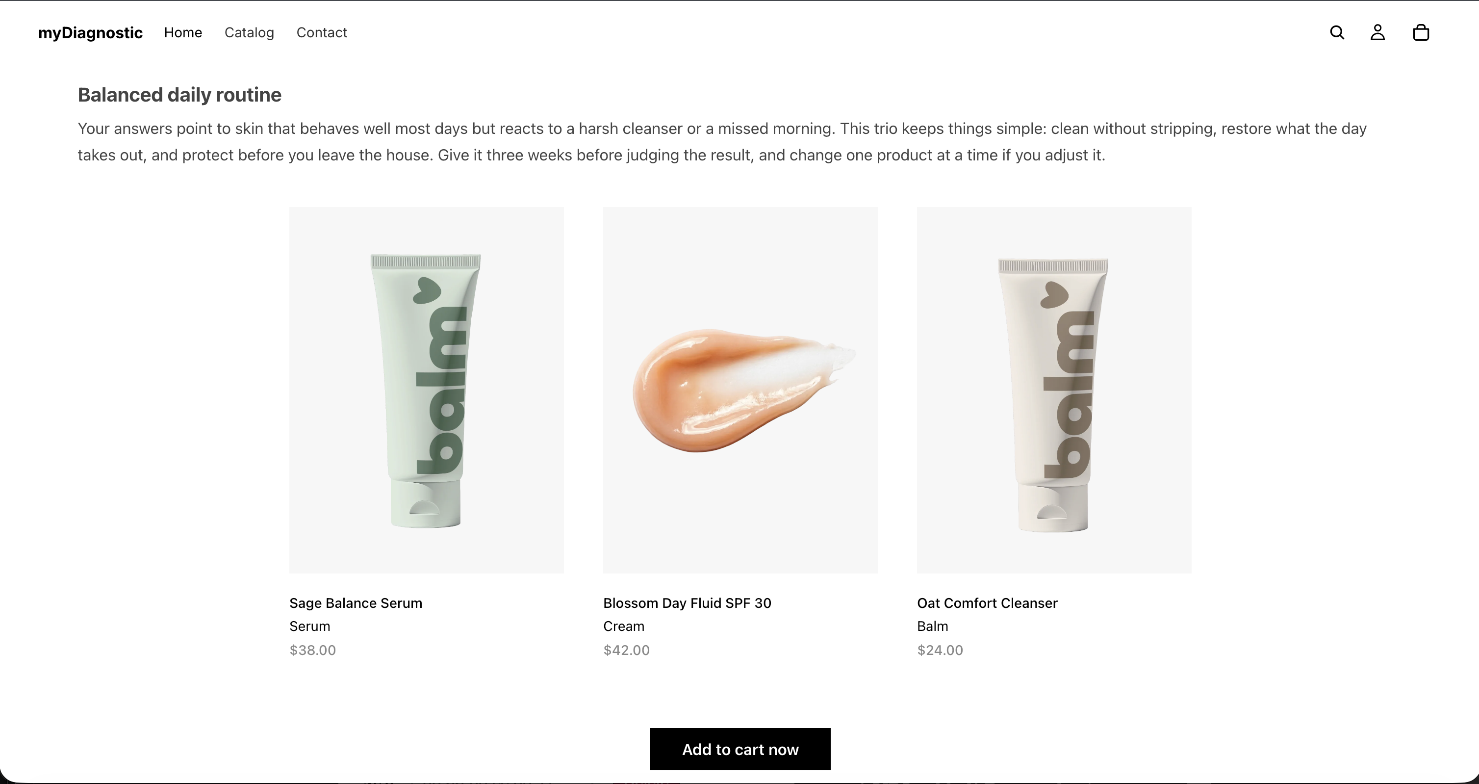
A card carries up to six things, in this order: the product image, a label, the product title, a line of description, the price, and the add to cart button. The image and the title are always there. The other four appear only when you turned them on or filled them in.
The label is the one you typed next to that product in the trio of a scenario, in the field whose placeholder reads Custom label. It appears only on a result that matched a scenario. When no scenario matches the three winning products the customer still gets their result, with the same cards and no label on any of them.
On a phone the cards stack, one per row. Cards per row (mobile), in the Product cards section, changes that. It offers 1 card per row and 2 cards per row, and a new quiz starts on 1 card per row. Its help text says what the second option does with a full trio: Two per row splits the width using the mobile gap above. With three products the third card sits alone on the next row, aligned with the first.
Show a price and a description
Both controls sit in the Products section of the panel.
Show price puts the product's price under its title. The price is read from Shopify each time the screen is built, so it follows a price change in your catalogue with nothing to update here.
Product metafield key puts a line of text under the product's title, taken from a product metafield you name. Its help text reads Optional Shopify metafield (namespace.key) shown under each product title. Example: custom.short_description.
One key serves the whole quiz. Every card reads that same metafield on whichever product it shows, so write the sentence you want on a result card into that metafield on each of your products. A product with no value for the key shows nothing in that spot rather than an empty line.
- Select Results in the left sidebar.
- Open the Products section of the panel.
- Type your metafield in Product metafield key, as the namespace, a full stop, then the key.
- Select Save.
Swap to the second product image on hover
Swap to the second product image on hover, in Products, arrives cleared. Tick it and a card fades to the product's second image in Shopify while the pointer rests on it, then back when the pointer leaves.
Three limits decide whether a customer ever sees the swap, and the help text names two of them: Uses the second image of the product in Shopify. Products with only one image are unchanged, and touch screens always show the first image.
- A product with a single image renders exactly as it did before, and hovering it does nothing.
- A product whose second image is the same picture as the first shows no swap either.
- A phone and a tablet have no hover, so their customers see the first image for the whole visit.
Treat the swap as a refinement for desktop customers. Anything a customer has to see belongs in the first image, in the metafield description, or in the scenario copy.
Choose how the customer adds to the cart
Add to cart mode, in the Add to cart section, carries the help text Choose how the user adds the recommended products to their cart. and offers three options:
- Bundle (single CTA adds all products) puts one button under the row of cards, which adds all the recommended products at once. A new quiz starts here.
- Individual (one button per product) puts a button on each card, which adds that product only.
- Both (bundle CTA + per-product buttons) shows both.
The bundle button's label is Bundle button text, in the same section, and it appears in Bundle and in Both. Leave it empty and the button reads your store's own wording, Add to cart now, which is what its help text means by Empty = inherits the App wording value (Settings).
The per-product button reads Add to cart from that same store wording. Change it for one quiz in the Design tab, in 'Add to cart' button (per product), or for every quiz in the app Settings, in the App wording card, under the group Result screen and cart, see App wording.
Decide what happens after an add
Two selects in Add to cart answer that question, one per kind of button, each offering Stay on the result page and Go to the cart page:
- After adding one product appears in Individual and Both, and starts on Stay on the result page.
- After adding the bundle appears in Bundle and Both, and starts on Go to the cart page.
On Stay on the result page the button confirms the add and the customer keeps reading the result. The app refreshes your theme's cart behind them: the cart icon, its count, and the contents of the cart drawer when your theme has one. It never opens that drawer. Opening it is the theme's own behaviour, and a result screen that pulled a drawer over itself after every add would hide the recommendations the customer is still reading. A link reading View cart → appears next to the button so there is always a way through to the cart.
On Go to the cart page the browser leaves the result for the cart page as soon as the add succeeds.
Both help texts state the same thing about the first option: Staying on the page refreshes the theme cart icon and drawer in place.
Apply a discount code with the bundle
Bundle discount code, in Add to cart, appears in Bundle and Both and nowhere else. Its help text reads Enter a discount code you created in Shopify > Discounts. It will be applied automatically when the customer adds the bundle.
Only the bundle button carries the code. A per-product button never applies it, in Individual and in Both alike, so a customer who adds the same three products one card at a time pays full price. If the discount is your reason for recommending the trio, say so in the copy next to the bundle button.
One behaviour matters more than the setting itself: Shopify says nothing about a code it refuses. A code that is misspelled, expired, or does not apply to those products produces no error and no message. The products go into the cart, the customer arrives on the cart page, and the total carries no discount. Nothing in the app reports it either, so a broken code can run for weeks.
Test the code on your own store before you publish the quiz.
- Open the quiz on your online store and answer it through to the result.
- Select the bundle button.
- Read the total on the cart page and check that the discount is listed on it.
Run that check again when the discount reaches its end date, and after any change to its conditions, since a code that stops covering one of the three products fails the same silent way.
When a product is sold out
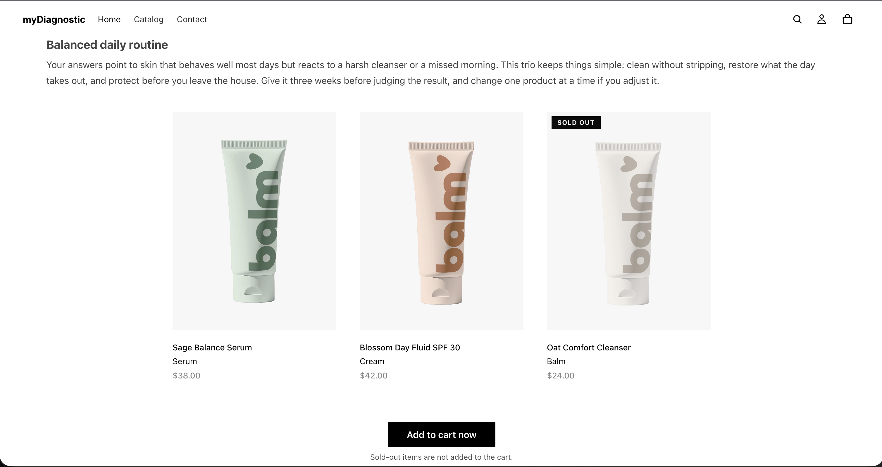
A product that Shopify reports as out of stock keeps its card. The image, the label, the title, the description and the price all stay, and a Sold out badge appears over the image. Leaving the price visible is deliberate: the customer can still judge whether the recommendation is worth waiting for.
What changes is the buttons:
- In Individual and Both, the button on that card is disabled and reads Sold out.
- In Bundle and Both, the bundle button stays active while at least one of the recommended products can still be bought. It adds those and leaves the sold out one out, and a line under it reads Sold-out items are not added to the cart.
- When every recommended product is sold out, the bundle button is disabled and reads Sold out.
Those four pieces of wording belong to the store, in Settings, in the App wording card, under the group Result screen and cart.
Place the scenario description and tips
Two selects in the Tips & Description section decide where the editorial part of the result lands, and they work independently of each other: Description position and Tips position. Each offers the same four values, and both start on Below the bundle button:
- Above the result title
- Below the subtitle
- Below the cards
- Below the bundle button
Tips position carries the help text Where each block renders relative to the product cards.
Both blocks hold the text of the scenario the customer matched. On a result where no scenario matched, both are empty and these two settings change nothing. Write that text in the Scenarios tab, see Result scenarios.
The scenario's image has no position of its own. When the matched scenario carries one, it appears directly under the title and the subtitle, above the cards and above anything you placed at Below the subtitle.
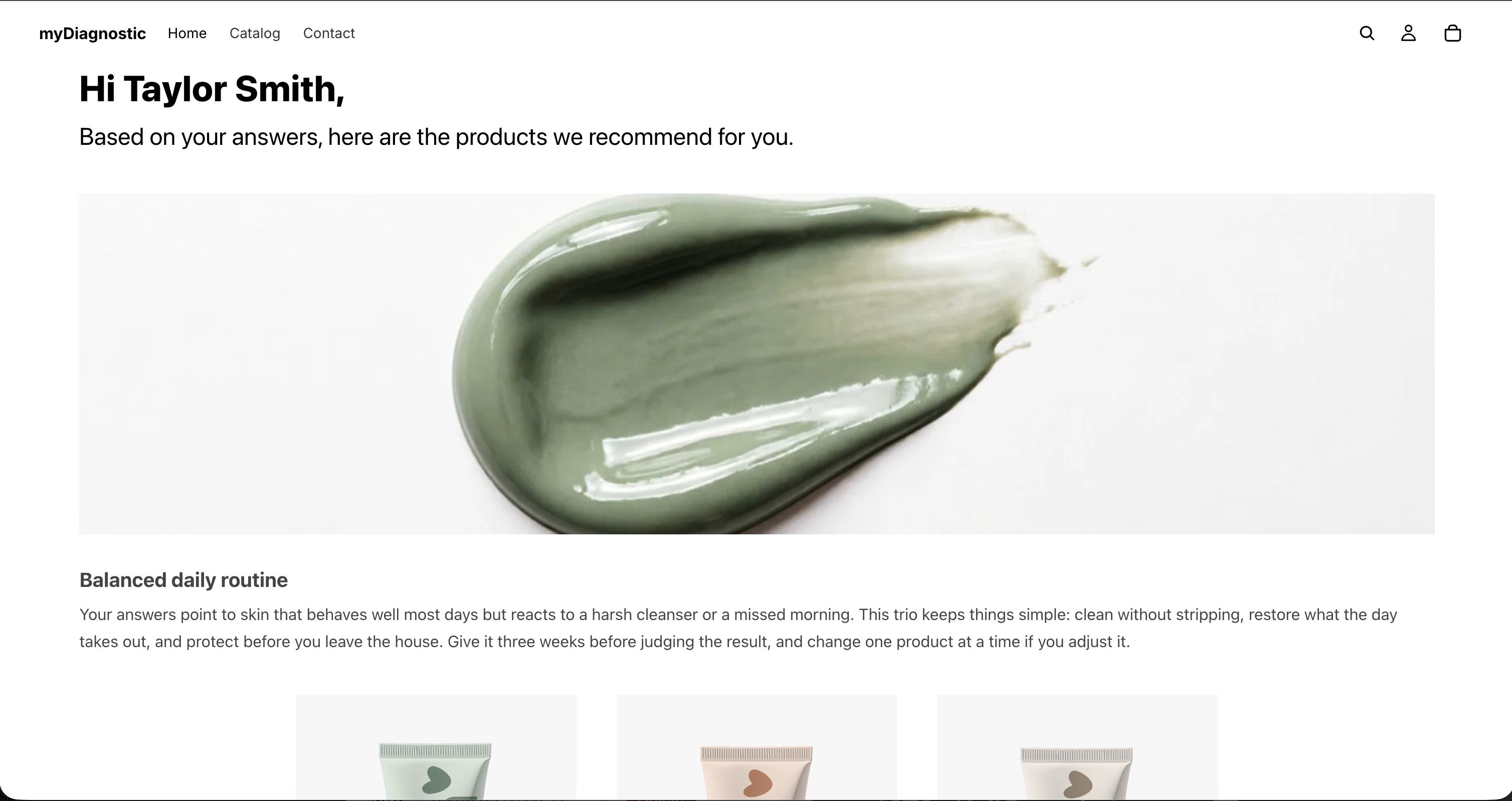
Personalise the title and the subtitle
Result title and Result subtitle sit in the Content section. A new quiz arrives with
Hi {name}, in the first and Based on your answers, here are the products we recommend for you.
in the second.
Both accept placeholders filled from the capture fields of your welcome screen. The help text under
Result title reads Supports {name}, {age} and {custom.<key>}. A variable with no value
disappears with the punctuation next to it. The <key> is the Field key of one of your own
fields, see Welcome screen.
That second sentence is the part to write around. A placeholder standing for nothing takes the
punctuation and the spacing next to it rather than leaving a gap, so Hi {name}, reaches a customer
who was never asked their name as Hi. A quiz with no capture field for a name therefore needs no
second version of the title.
Both fields are translated per language, next to the field they belong to. Serving a second language needs the Premium plan or above, see Secondary languages.
The Powered by badge
On the Free plan the quiz carries one line at the very bottom, under everything else on the screen, reading Powered by myDiagnostic. The name is a link, and it opens in a new tab.
It is part of the quiz rather than of this screen, so it sits under the welcome screen and every question too, and under the result last of all. No setting removes it. Any paid plan does, see Plans and quotas.
What your plan changes
No control on this screen is locked behind a plan. The cards, the metafield description, the price, the hover swap, the three add to cart modes, the two after-add settings, the bundle discount code and the editorial positions all work on the Free plan.
Two things around the screen do depend on your plan:
- The Powered by myDiagnostic badge, shown on Free only.
- The labels, description, tips and image that a scenario adds to a result, since scenarios need the Basic plan or above. On Free the positions are still yours to set, and every result is a generic one with nothing to place.
See Plans and quotas for what else each plan carries.