Welcome screen
The welcome screen is the page a customer reads before the first question, and the only place a quiz can ask them for anything other than an answer. By the end of this page yours carries its copy, its background, its layout and the fields you collect.
Before you start
- A quiz open on its Questions tab.
- Your background images ready, if you want the screen to open on a photograph.
Add the welcome screen
A quiz has no welcome screen until you add one, and it holds one at most.
- Select Add page at the bottom of the left sidebar.
- Select Welcome in the menu, described there as Intro screen with optional capture fields.
- Select the new page in the sidebar to open its settings on the right.
The Welcome entry disappears from the menu once the quiz has its screen. Add page is disabled while you have unsaved changes, with the title Save or discard your changes first, so save or discard before you add it.
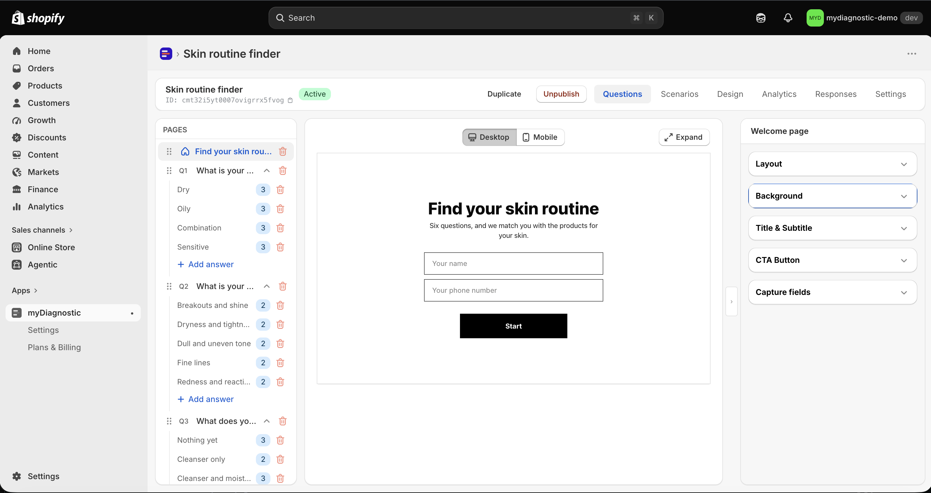
The panel on the right holds five sections: Layout, Background, Title & Subtitle, CTA Button and Capture fields.
To remove the screen, select the trash icon on its row in the sidebar. A confirmation appears, titled Delete the Welcome page? while the page has no title of its own, and reads This page and its content will be deleted. Recorded quiz responses are kept. Confirm with Delete page. The deletion is written to the quiz straight away, so Discard does not bring the page back.
Without a welcome screen the quiz opens on the first question, and nothing is collected from the
customer. Everything you would have captured stays empty for the rest of the run, so a result title
written as Hi {name}, reaches that customer as Hi.
Write the title, the subtitle and the button
The Title & Subtitle section holds two fields, both empty on a new page.
- Enter the heading in Title.
- Enter the line under it in Subtitle.
Leave both empty and the customer sees no text block at all, only the background and the button.
The button label lives in the CTA Button section, in Button text, with the help text Empty = inherits the App wording value (Settings). Leave it empty and the button reads the app's own label, in the language the customer is browsing in. Fill it in and this quiz uses your wording instead, which is what to do when the button should say something other than a plain invitation to start. To change the label for every quiz at once, edit it in the app settings, see App wording.
All three texts are translated per language, next to the field they belong to, see Secondary languages.
Set the background
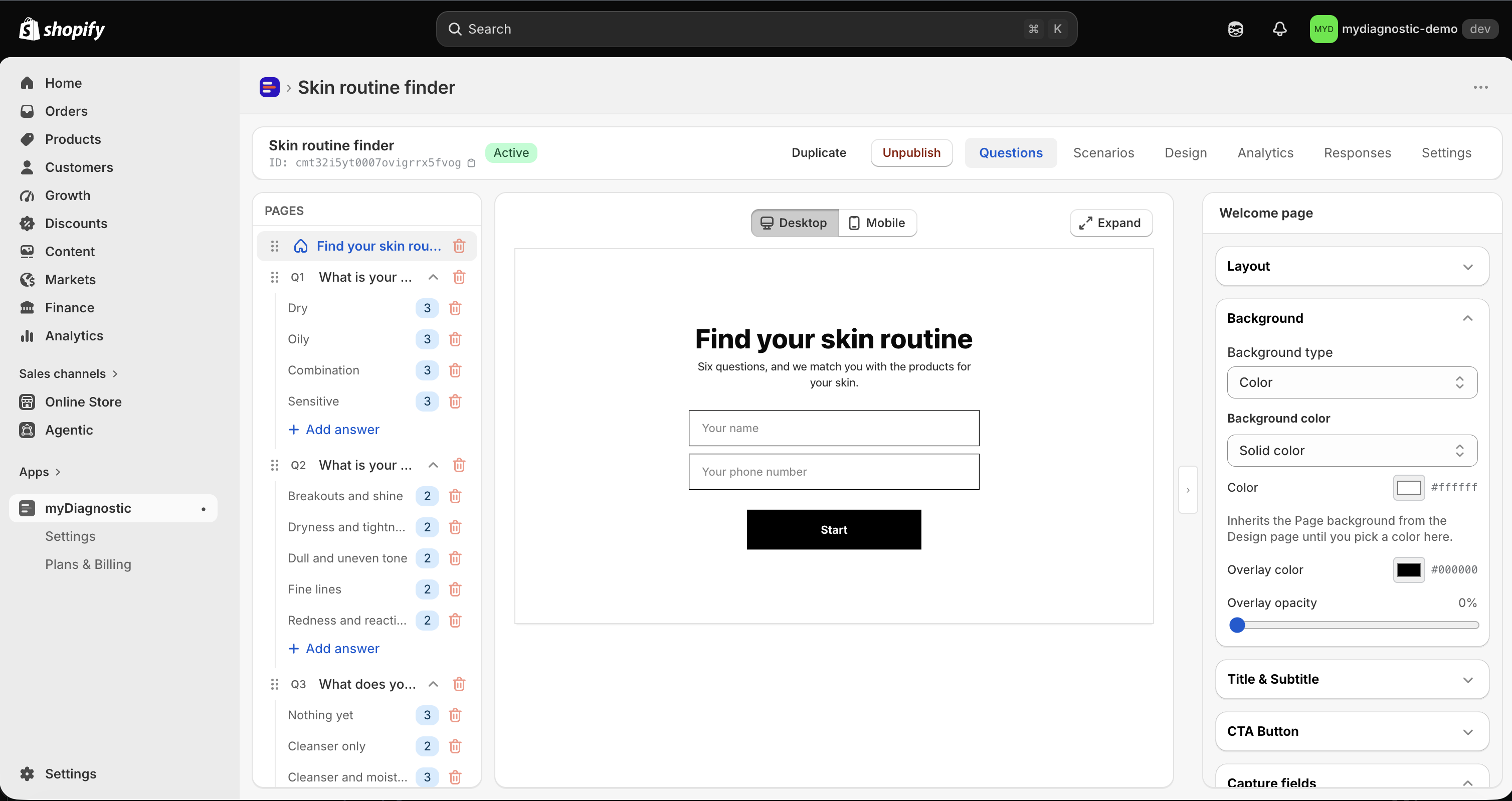
The Background section opens on Background type, which offers Color and Image.
Color covers a flat colour and a gradient. Choose between them in Mode: Solid color takes one colour, Gradient takes a Start colour, an End colour and a Direction.
Image takes two uploads. Desktop image carries the help text Shown on large screens., and Mobile image carries Shown on phones. Falls back to the desktop image when empty. That fallback runs one way only: a phone shows the desktop image when you leave the mobile one empty, but a desktop never shows the mobile image. Upload the desktop image first, then add a mobile one when the desktop framing crops badly on a narrow screen.
Both types can carry a veil over the background, set with Overlay color and Overlay opacity, from 0 to 80 percent. A new welcome screen starts at 0, with no veil. Raise it when the text sits on a busy photograph and stops being readable.
Place the content block
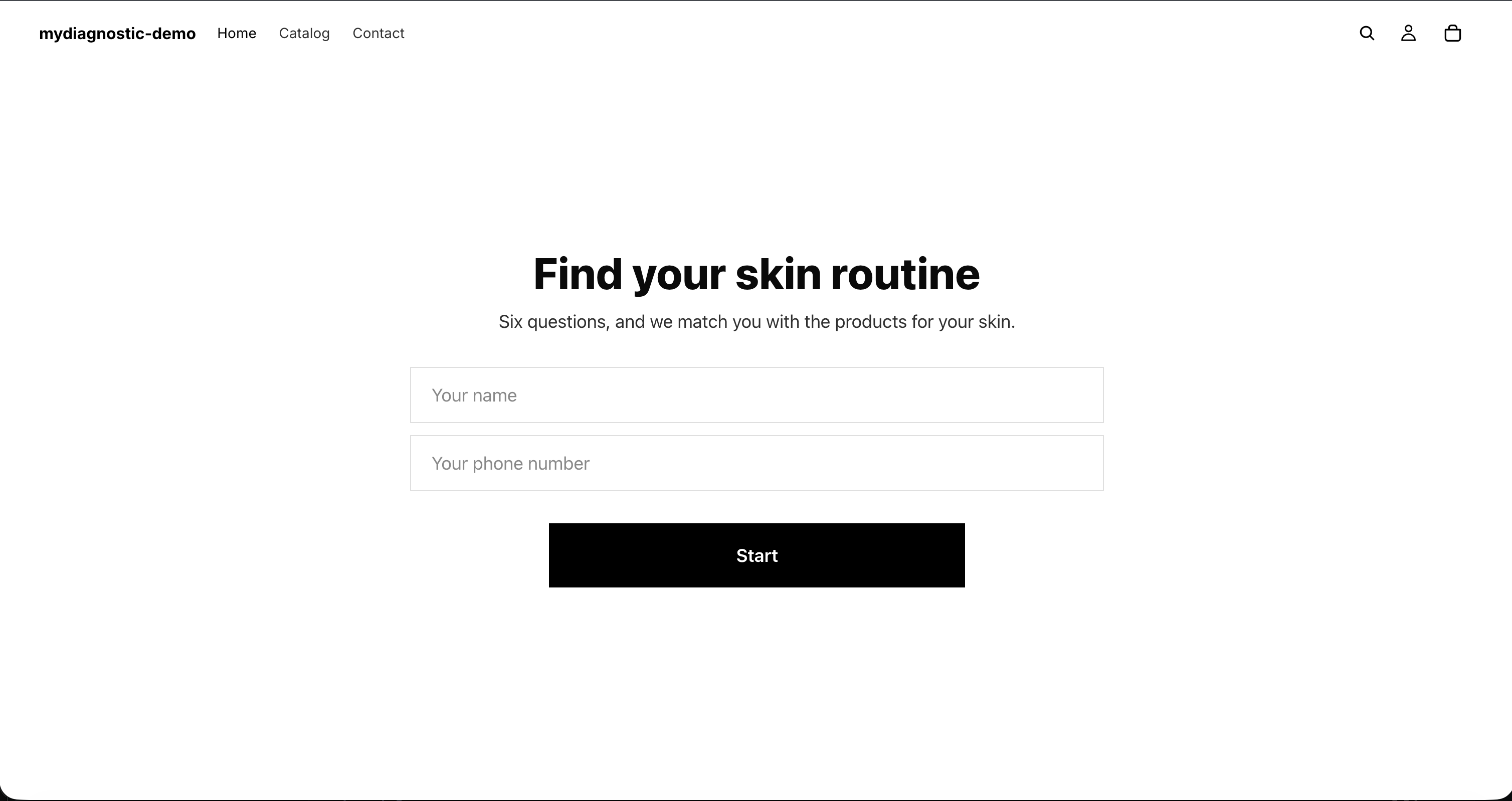
The Layout section decides where the text, the fields and the button sit over that background. Four things are set separately, so changing one never moves another:
- Where the column sits, with Content position across the panel and Content position (vertical) up and down it.
- How far it stands from the edge it was sent to, with Offset from edge and Offset from top or bottom.
- How wide it is, with Content panel width.
- How its contents line up inside it, with Content alignment.
Padding sides and Padding top and bottom add breathing room inside the column, and Min height sets how tall the screen is before its contents make it taller.
Almost every one of those has a mobile twin, named after the desktop control with (mobile) at the end. A mobile selector offers Inherit from desktop as its first value, and a mobile slider reads the desktop value it inherits until you move it, with a Reset next to it that hands the setting back. So set the screen up on desktop first, then override only what a phone renders badly.
Min height (mobile) raises a floor that is set once for every screen of the quiz, in the Design tab, under Quiz height, in Minimum height (mobile), see Design and tokens. A page can raise that floor for itself, never lower it, so this slider is where a welcome screen that needs to be taller than the rest is made taller.
Some settings have one value for both screens, and changing them changes both: Overlay color and Overlay opacity, the title and subtitle fonts, the subtitle opacity, the capture field font size, the background type and its colour, and the colour overrides on the button. The background image is the exception in that group, since it has its own mobile upload.
Add capture fields
A capture field is a box the customer fills in before starting. The Capture fields section holds them, and an empty section reads No fields yet. Use the quick-add buttons below or create a custom field.
For the four usual ones, use the buttons under Quick add:.
- Open the Capture fields section.
- Select + Name, + Age, + Email or + Phone.
Each button disappears once its field is on the page. + Name arrives required, the other three optional, and + Age arrives accepting a number between 1 and 120.
For anything else:
- Select Add custom field.
- Enter the wording the customer reads in Label.
- Choose Field type: Text, Number, Email, Phone, Select (dropdown), Textarea or Checkbox.
- Choose where the value is kept in Store as.
- Enter the grey text shown inside the box in Placeholder.
- Select Save.
Field key fills itself in from the label and is the name you use to read the value back later, so change it only if you have a reason to. Three more controls appear according to the type you chose: Options (one per line) on a Select (dropdown), Min and Max on a Number, and Regex pattern (optional) on a Text.
There is no limit on the number of fields, which does not make a long form a good idea: every extra box is one more reason to abandon the quiz. The customer meets them in the order of the list, and that order is changed with the arrows at the start of each row.
Make a field required
Turn on Required in the field, in the quick add presets as well as in Add custom field. A required field carries a red asterisk after its label in the list.
When the customer selects the start button with a required field empty, or with a value the field refuses, three things happen at once: the field is highlighted, it takes the focus, and the message Please complete this field. appears under the fields. The quiz does not move on until the field is filled in. The message goes away as soon as the customer types in it.
Ask for what you need to run the quiz and mark that required. Make everything else optional: a field the customer cannot answer is a field they close the page on.
Reuse a captured value later
A captured value can be written into the copy the customer reads afterwards. Four placeholders are
available: {name}, {age}, {email} and {custom.<key>}, where <key> is the Field key of
one of your own fields.
They work in the Result title and the Result subtitle, and in the result email, see Result email. They do not work in the Title and Subtitle of the welcome screen itself: that screen is shown before anything has been filled in, so a placeholder there would have nothing to stand for, and it reaches the customer as the text you typed.
Two behaviours are worth knowing before you write the copy:
- A placeholder with no value takes the punctuation and the spacing next to it rather than leaving a
gap.
Hi {name},reads as Hi for a customer who was never asked their name, and a line holding nothing but the placeholder disappears. - A name that matches no field is treated as empty and disappears the same way, so a typo in a key costs you the sentence around it rather than showing braces to the customer.
Where the values end up
Store as decides where each answer is kept. Name, age and email each go to a field of their own
on the response. The phone number and every custom field go to a separate store, which is what makes
them reusable through {custom.<key>}.
A value stored as the email is kept only when it reads as an email address, and anything else is dropped as the response is recorded, with no warning to the customer and no trace in the admin. That matters most on a Text or a Textarea field pointing at the email, since neither checks the format while the customer types.
That difference shows in what you can read afterwards. The Responses tab lists Date, Name, Email, Age, Scenario, Products and Result, and the CSV export carries the same seven columns, with the result column holding the link to the customer's result page. The phone number and the custom fields appear in neither: they are collected and usable in your copy, but there is no screen in the app that shows them back to you. Ask for a custom field when its value is going to be used in the copy or by an email tool, and not in order to read it later in the admin.
Give each field its own destination. Two fields pointing at the same one raise the warning Duplicate storage mapping, which explains that only one of the two values is kept on the response. The other is lost, with no way to recover it. Several custom fields are free of that problem, since each one is kept under its own key.
What your plan changes
Nothing. The welcome screen, all seven field types and the whole layout panel work the same on Free as on Unlimited. The limits of the Free plan sit elsewhere, on the number of quizzes and the number of responses per month, see Plans and quotas.
What not to collect here
The app does not check what you ask for. Any label you write is accepted, and nothing warns you about the kind of information you are collecting, so what happens on this screen is your responsibility.
Two rules keep you out of trouble. Ask only for what the quiz genuinely needs to recommend a product or to send the result. And never ask for health information here, or for anything else people would consider private: a medical condition, a treatment, a diagnosis, a pregnancy, an origin, a belief, anything about a child. A quiz for skin, hair or diet can be built entirely out of preferences and habits, which are not health data, and that is the form to write.
What the app stores about your customers, how long it keeps it, and how to remove it, are covered in Data and privacy.