Design and tokens
The Design tab holds every appearance setting of one quiz, from its colours and fonts to the height of its screens and the transition between them. By the end of this page yours matches your storefront, on a desktop screen and on a phone.
Before you start
- A quiz open in the editor.
- The colours and the fonts of your online store to hand.
Where the design settings sit
Select Design in the row of tabs at the top of the quiz.
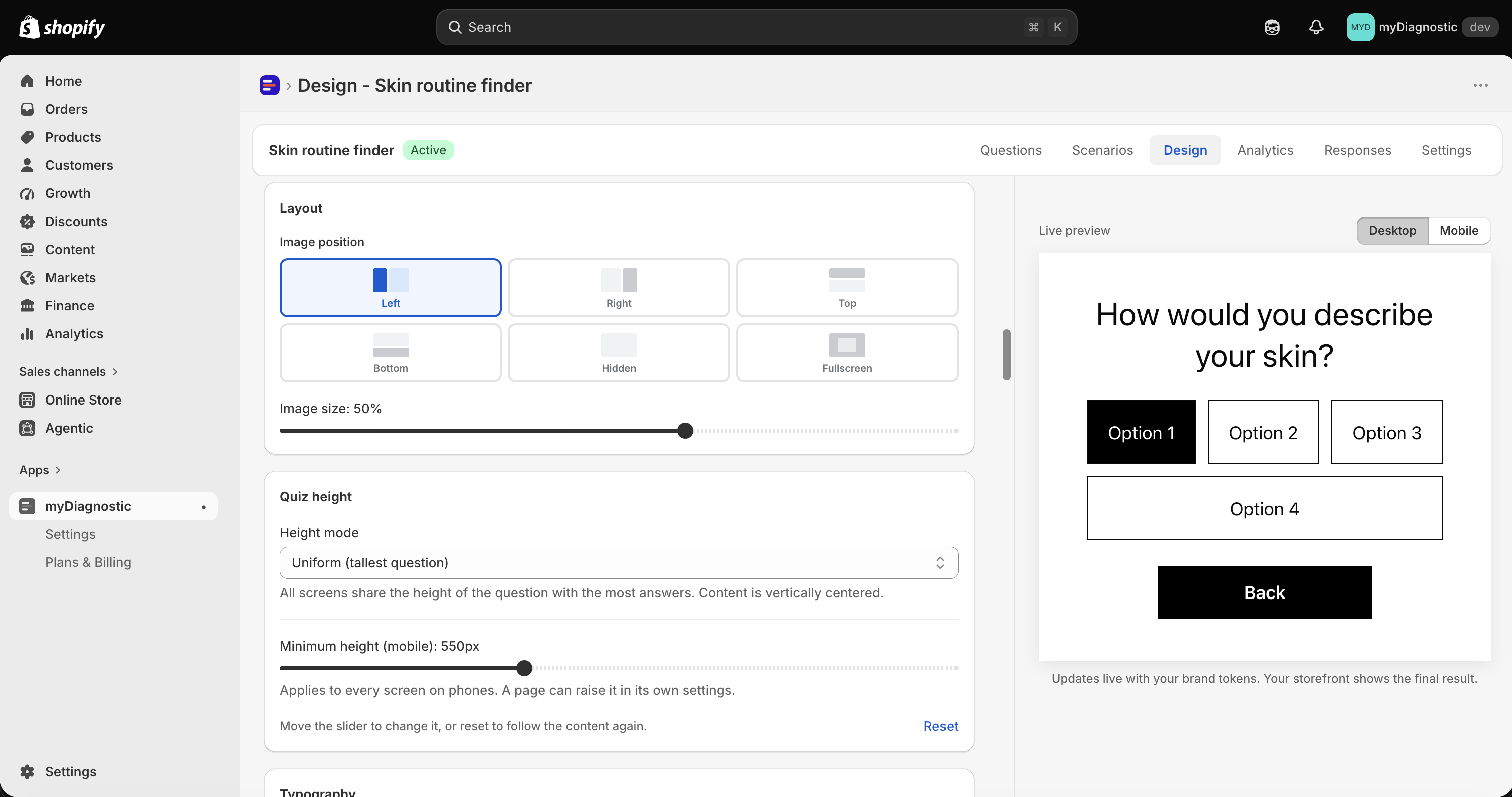
The settings fill the left of the screen and the Live preview sits on the right, following every change as you make it. Its Desktop and Mobile buttons switch the viewport it draws. The line under it reads Updates live with your brand tokens. Your storefront shows the final result., which is worth taking literally: the preview is an approximation of a browser, not the browser your customer uses.
The settings come in two panels, one above the other.
The upper panel holds six numbered cards, and each one applies to the whole quiz: 1. Colors, 2. Typography, 3. Spacing & corners, 4. Buttons & Inputs, 5. Animations and 6. Custom CSS (advanced). 1. Colors is open when you arrive and the other five are closed. Select a title to open or close it.
Under them sits Granular controls (advanced), a closed section described as Per-element overrides applied on top of the global tokens above. It holds one card per element: Layout, Quiz height, Typography, Answer buttons, Colors, Progress bar, Spacing & alignment, Navigation, Images, Animations, Product display, Mobile responsive and Result page.
Nothing on this tab reaches your storefront until you select Save.
Set your colours
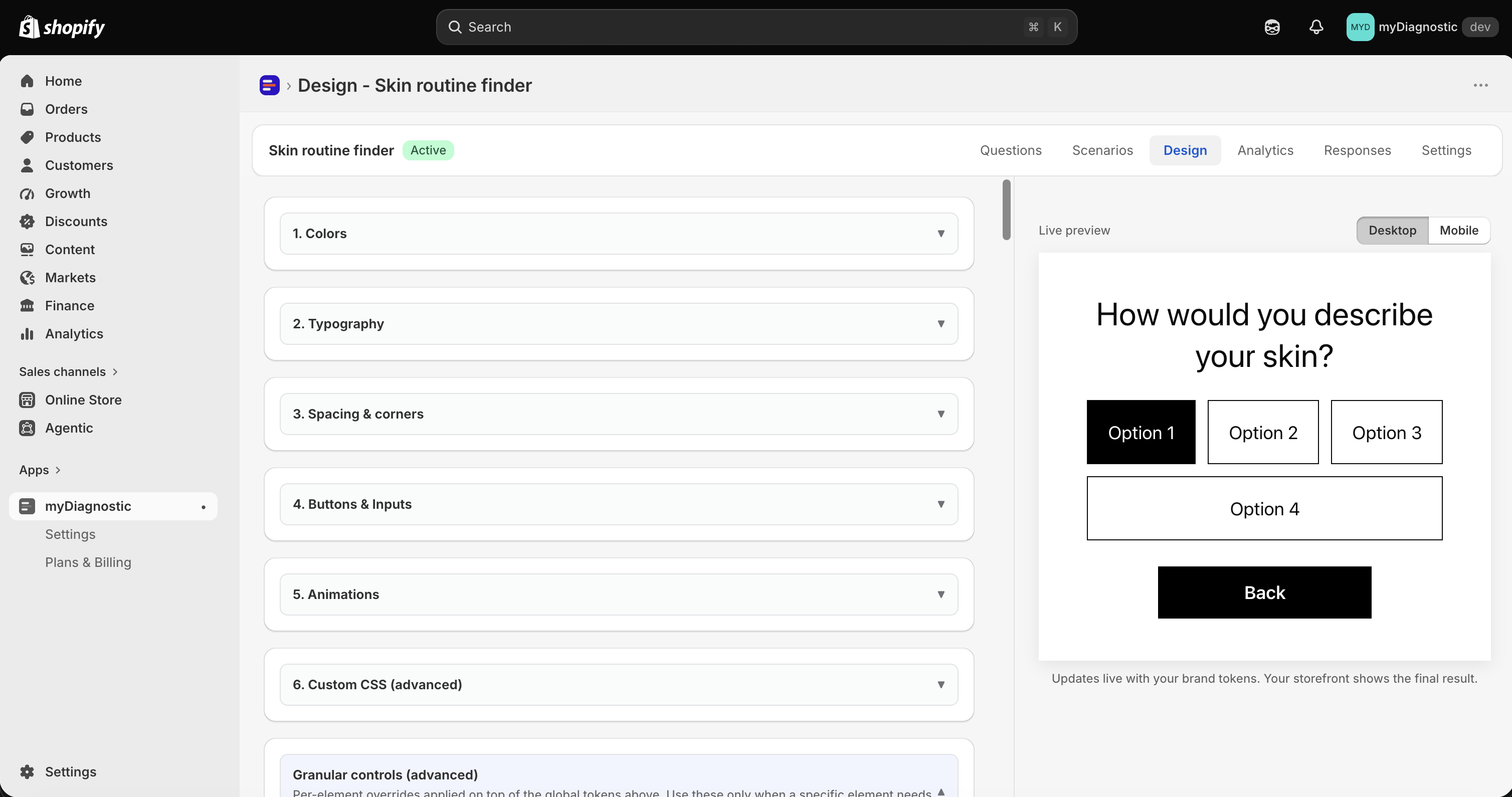
1. Colors holds seven colour fields and one background, grouped by what they do. Each takes a hex value, either from the colour square or typed into the field next to it. State hover is the one that also accepts a transparent value.
Here is where each one lands on your customer's screen:
- Brand primary is the accent of the quiz: the fill of an answer once it is selected, the progress bar and the link to the cart. The add to cart buttons on the result screen fall back to it, so they follow it only while that screen sets no button colours of its own.
- Text primary colours the question, the answer text and the titles of the welcome screen.
- Text inverse colours the text of a selected answer, so it stays readable over Brand primary.
- Surface default fills the cards and the input boxes, described in the app as Cards and input fields: email gate card, result card, capture and email fields.
- Border default draws the outline of the answer buttons.
- State hover fills the track the progress bar runs along.
- State focus colours the small label above a product name on the result screen, and the hint line under a question that accepts several answers.
- Page background is the background of every screen of the quiz: welcome, questions, email gate and result.
Page background is also the one control in this card that takes a gradient rather than a flat colour.
- Open 1. Colors.
- Set Mode to Gradient.
- Choose the first colour in Start and the second in End.
- Choose Direction: Diagonal ↘, Horizontal →, Vertical ↓ or Diagonal ↙.
A strip under the four controls previews the result. A gradient holds two colours, no more, and its direction is the select rather than an angle you type.
Three other surfaces take a gradient the same way, all of them in 4. Buttons & Inputs: Background and Text color under CTA buttons, and Border color under Capture inputs. Each carries the same Mode select, the same Start and End, and the same four directions.
A page can override the background for itself. When it does, its own value wins, and the Reset next to that page's setting hands it back to the value you set here.
Reset color tokens to defaults puts the seven fields and Page background back to how a new quiz starts.
Choose the fonts
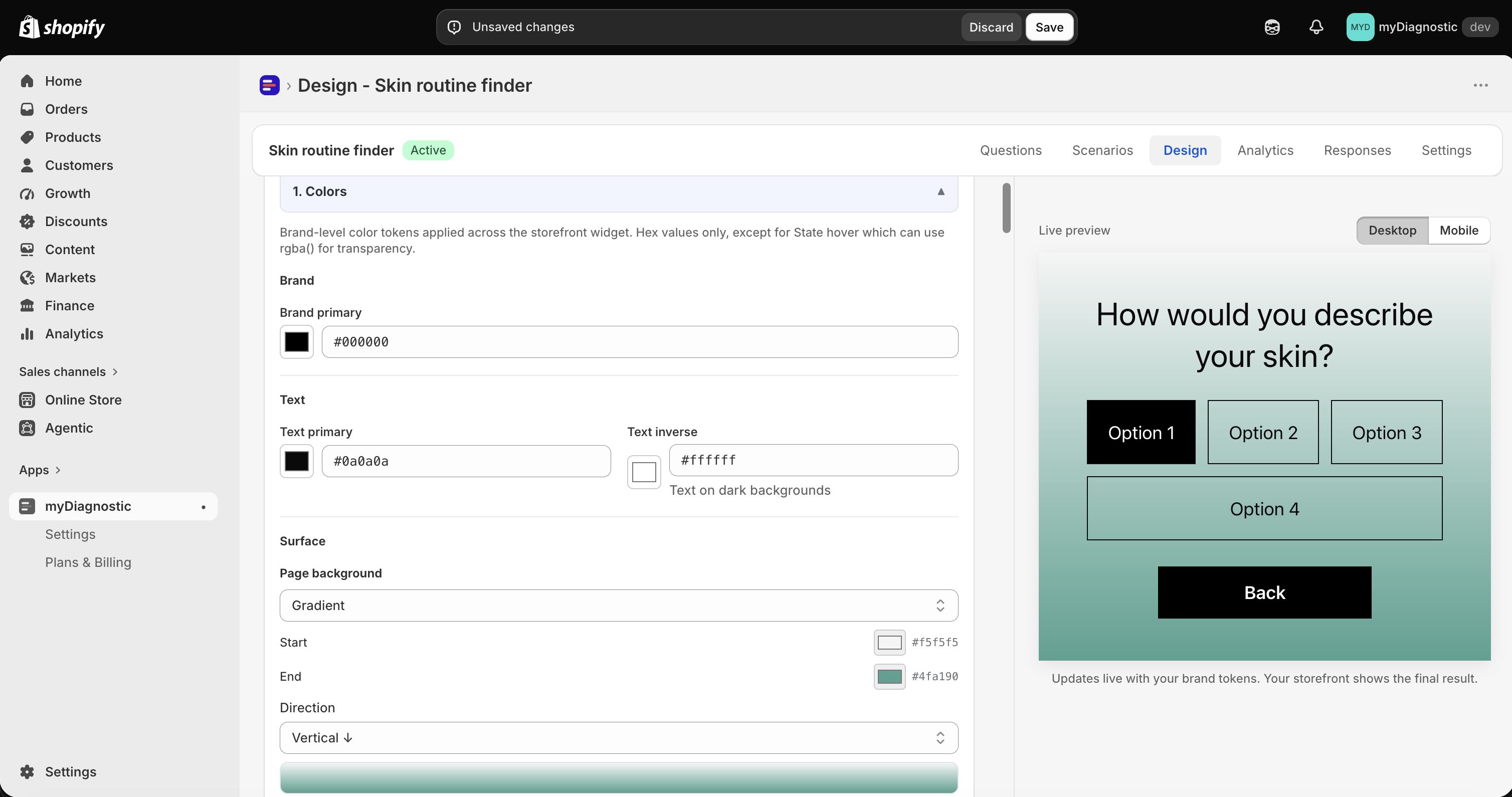
2. Typography sets the fonts of the whole quiz with two selects:
- Primary font family is used for the body and the answer text.
- Heading font family is used for the question and result titles, and follows the primary font until you pick something else for it.
Both offer the same thirteen entries: System default, Inter, Poppins, Manrope, Montserrat, DM Sans, Nunito, Playfair Display, Lora, Outfit, Space Grotesk, IBM Plex Sans and Custom (URL).
Custom (URL) is for a font you host or buy elsewhere. It opens two fields, Custom font URL for the address of the stylesheet, which has to start with https, and CSS font-family stack for the name of the font with a backup after it. The app then loads the address to see whether it answers, and tells you within five seconds: Loading font URL... while it tries, then Font URL loaded or Font URL did not load. On failure the storefront falls back to the system font, which is why the backup in the stack matters.
Sizes and weight sit under the two selects. Heading and Body take a size in pixels, and the Regular slider sets the weight from 100 to 900.
The Typography card inside Granular controls (advanced) goes one level down and sizes the two elements separately. Question takes Font family, Font size, Font weight and Text alignment. Answer buttons take Font family, Font size and Font weight.
Both Font family selects start on Use global font. That hands the element back to 2. Typography, not to your theme: the quiz never reads the font of your online store, and a quiz where you set no font at all renders in the system font of the device your customer is using. The answer select carries one extra entry, Same as question, which follows whatever the question is set to.
Choose the corner style
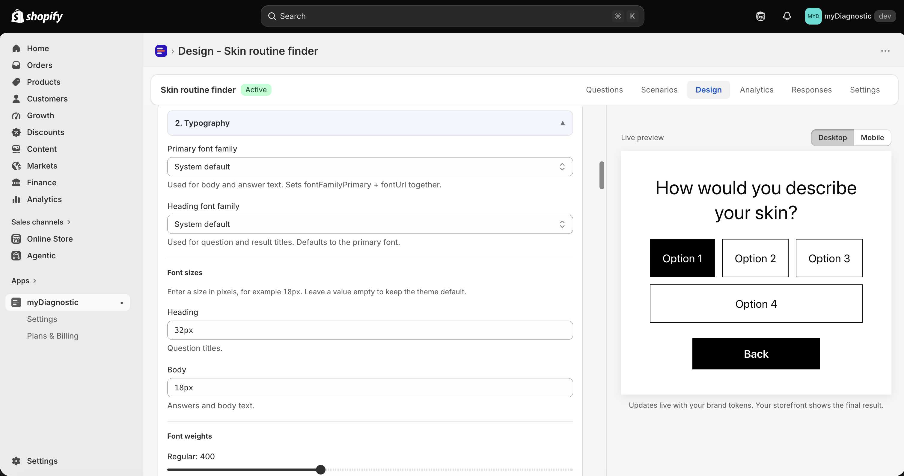
3. Spacing & corners holds Border radius preset, three choices described as Applies to buttons, answer choices, cards and input fields across the quiz.
- Open 3. Spacing & corners.
- Select Square, Rounded or Pill.
One choice writes four values at once, one per family of shape:
- Square squares everything, at 0 px.
- Rounded rounds buttons and answers at 16 px, cards and fields at 12 px, and the outer frame at 16 px.
- Pill turns buttons, answers and fields into full capsules, keeps cards at 16 px and the outer frame at 20 px.
The four families cover the whole quiz. Buttons and answer choices are the answer pills, the next and back buttons and the badge on a product card. Cards are the email gate card, the result card, the product cards and the tips. Input fields are the capture fields of the welcome screen and the email box. The quiz container is the outer frame, and its corners clip what touches them, which the app states as Outer frame of the quiz. The Powered by banner and full-bleed images are clipped to it.
Three things escape the preset:
- Fine-tune each shape, the four fields under the preset, one per family. Type into one and that family stops following the preset. The preset stays ticked where it was, since your value replaces what it wrote rather than the choice itself.
- A per page override. A page that sets its own Border radius keeps it whatever the preset says, and the Reset next to that setting puts the page back under the preset.
- Question images, which have their own Image border radius in the Images card of Granular controls (advanced) and are never touched by the preset.
Set the height of the screens
Open Granular controls (advanced) and find the Quiz height card. Height mode offers two answers to the same question, how tall a screen of this quiz is.
Uniform (tallest question) measures every screen of the quiz, the welcome screen, all the questions, the email gate and the result, then gives them all the height of the tallest one, with the content centred vertically. The app describes it as All screens share the height of the question with the most answers. Content is vertically centered.
That measurement is what stops the page from jumping. A question with two answers is exactly as tall as a question with six, so the quiz keeps the same size from one screen to the next and nothing underneath it moves while your customer answers. The height is measured again whenever the browser window is resized or the phone is turned, so it stays right after a rotation.
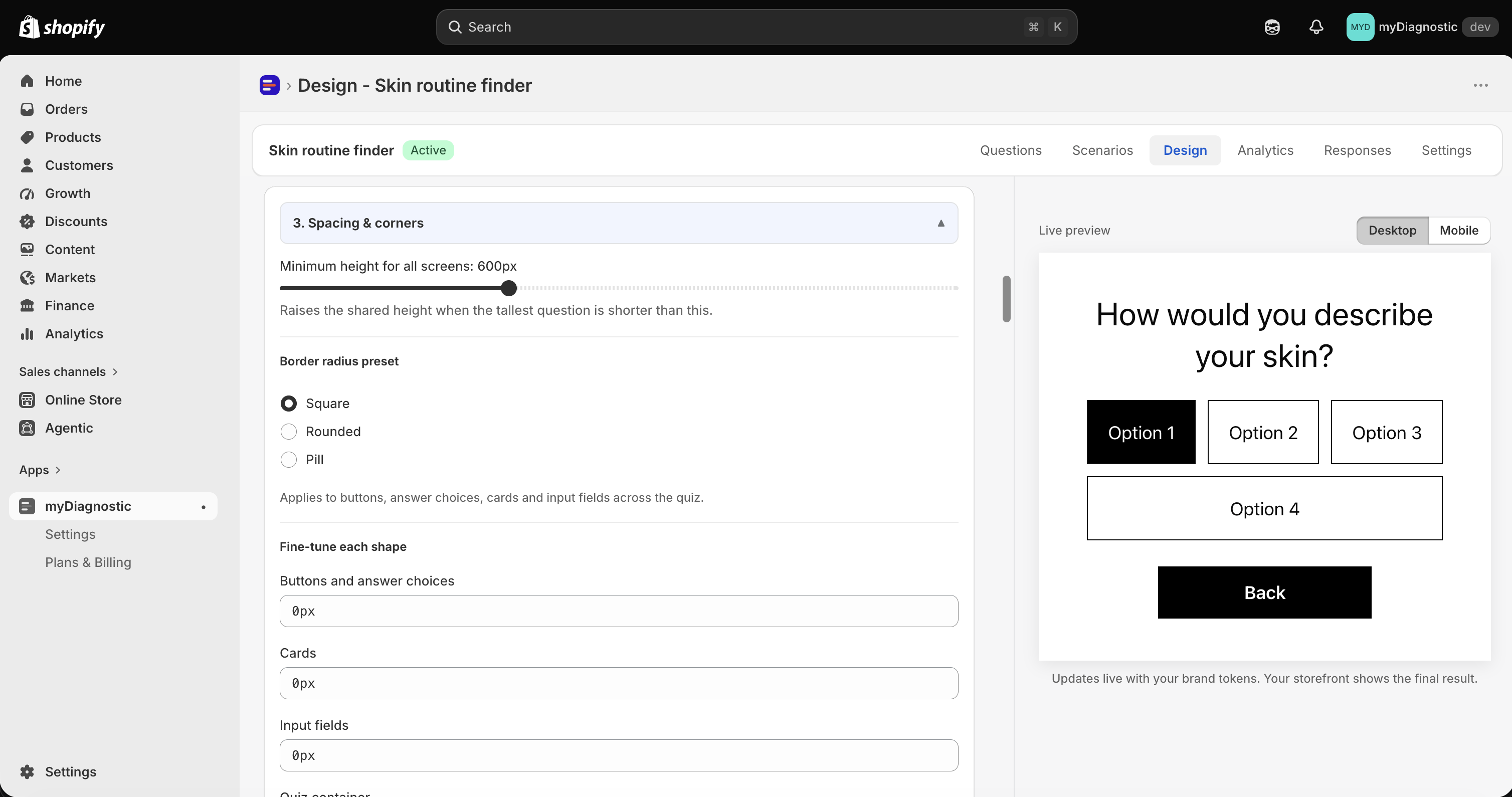
Minimum height for all screens, in 3. Spacing & corners, raises that shared height when the tallest screen comes out shorter than the value you set. It goes from 300 px to 1200 px and starts at 600 px.
Fixed minimum replaces the measurement with a value you type into Minimum height, either in pixels or in a share of the screen, which the app illustrates as e.g. "600px" or "80vh". Screens are at least that tall, and content that does not fit scrolls inside them.
Phones are treated differently. Screens are not made uniform there, their height follows their content, which is what keeps a short question short on a small screen. Minimum height (mobile) sets a floor under that. It is not set on a new quiz, it runs from 300 px to 1000 px, and its Reset puts it back to being unset. Its help text, Applies to every screen on phones. A page can raise it in its own settings., describes both halves of the rule: it applies everywhere on a phone, and a page can raise it for itself but never go below it.
Choose the transition between screens
The Animations card in Granular controls (advanced) holds Screen transition, with four values: Slide vertical (default), Slide horizontal, Fade and None. A new quiz slides vertically. Duration sets how long the movement takes, from 150 ms to 800 ms, and disappears when you choose None.
5. Animations holds one setting, Reduce motion when the visitor asks for it, with Enabled (recommended) and Disabled. It arrives enabled.
Some people turn animations off in the settings of their phone or computer, often because movement on a screen makes them unwell. With this enabled, those customers get the same quiz with instant screen changes instead of the transition. Everyone else sees the transition you chose. Leave it enabled: Disabled plays the animation at everyone, including the customers who asked their device not to.
Global settings against per page overrides
Three levels can set the same thing, and the rule between them is one sentence: a per page setting always wins, a granular control counts only once you have moved it away from its default, and the global token applies everywhere else.
In practice that gives an order of work. Set the six numbered cards first, since they cover the whole quiz. Open Granular controls (advanced) only when one element has to differ from them. Go into a page's own settings only when that single screen has to differ from everything else.
Reaching that third level takes one action. Every page of the quiz opens its panel on a checkbox titled Use global theme settings for this page, ticked by default and described as When enabled, this page inherits all design tokens from the global Design page. Disable to override image visibility, layout mode, and other settings below.
Untick it and a block titled Page-specific overrides appears in its place, holding the controls that page is allowed to set for itself. On a question those are Show image on desktop and Image position, with Content alignment (horizontal) under them, joined by Content alignment (vertical) once the position is None (no image, content full-screen). Image position is what decides the side a question image takes, see Questions and answers.
Ticking the box again hands the page back to the global theme and keeps what you set. The values stay recorded and stop being applied, so unticking a second time brings them back as you left them, and trying an override costs nothing.
Three Reset controls undo at three different scales:
- Reset color tokens to defaults, at the bottom of 1. Colors, puts the seven colour fields and Page background back.
- Reset granular controls to defaults, at the bottom of the disclosure, puts every granular card back at once. It also empties the three button labels in the Result page card, which sends those buttons back to your app wording, see App wording.
- The Reset next to a single setting in a page's own panel clears that one value, so the page goes back to inheriting.
None of the three writes anything on its own. Each one changes the tab in front of you, and Save is still what records it.
Change a setting for mobile only
A setting that has a mobile twin follows one rule: the mobile value applies when you set it, and the desktop value applies when you leave it alone. Leaving a mobile control untouched is therefore the normal state, not an omission, and it is why a quiz you set up on a desktop screen already renders on a phone.
The Mobile responsive card is the exception, and it is worth knowing before you spend time on a setting that a phone ignores. Its intro reads Applied on screens under 768px wide., and its six values apply below that width whether or not you have touched them:
- Image display and Image height, for the question image.
- Content padding and Question font size.
- Answer font size and Button vertical padding.
So the question size you set in 2. Typography or in the granular Typography card is what a desktop screen renders, while a phone renders Question font size from this card. Set the two together, or a font change looks like it did nothing on a phone.
Several settings have no mobile twin at this level at all: the colours, the corners, the font families and weights, the alignment of the question text, the padding and border of the answer buttons, the progress bar, and the fit, radius and overlay of the images, along with the transition and its duration. Change one of those and both viewports change together. Per device control for one screen lives in that screen's own settings, see Welcome screen.
Custom CSS Pro plan and above
6. Custom CSS (advanced) takes up to 5000 characters of your own CSS. It is available on Pro and above. On Free and Basic the card shows an upgrade banner in place of the field.
- Open 6. Custom CSS (advanced).
- Write your rules in Custom CSS.
- Select Validate CSS.
- Read what the app reports, then select Save.
Validate CSS answers with No issues found or with Some declarations would be stripped, listing what it would remove, and it shows the beginning of what will actually be sent to your storefront.
Two things happen to your CSS on the way there. It is wrapped so that it can only reach the quiz, which keeps a stray rule from spreading to the rest of your theme, and a short list of declarations is removed: script tags, javascript addresses, the legacy expression and behavior properties, stylesheet imports over plain http, and fixed positioning. Unbalanced brackets are repaired for the same reason, since one bracket too many would let the rest of your CSS escape the quiz.
Two limits are worth stating plainly.
- CSS the browser cannot make sense of is ignored in silence. A misspelt property or a selector that matches nothing produces no warning here and no warning on your storefront. The rule has no effect, and that is all you are told.
- The Live preview does not apply your custom CSS. It shows the quiz with your tokens and nothing else, so the only way to see your rules is to open a published quiz on your online store.
If you move to a plan without Custom CSS, your rules are kept but stop being applied, and they come back if you move up again. See Plans and quotas for what each plan includes.
Save and discard
One Save covers the whole tab: the six numbered cards, every card inside Granular controls (advanced), and the button labels of the Result page card together with their translations. Until you select it, nothing you changed here has reached a single customer.
Discard puts the tab back to its last saved state. It leaves Granular controls (advanced) open if you had opened it, since whether a section is expanded is your view of the page and not a setting of the quiz.
Leaving the tab with unsaved changes asks you to confirm first. Confirm and your changes are dropped, cancel and they are still there for you to save. Closing the browser tab warns you in the same way.
Whether the disclosure is open is remembered with the quiz, so you find the panel as you left it next time. It travels with your next Save, which means opening it and leaving without changing anything records nothing.